1. Purpose of This Guide
A personal data flow diagram shows how personal data moves through your organisation — from the moment it is collected from a customer, staff member, or other individual, all the way through processing, storage, and sharing.
For Cyber Essentials and similar standards, this diagram proves that your organisation:
-
Understands where personal data lives,
-
Knows who processes it,
-
Can identify risks, access points, and safeguards, and
-
Has a clear, documented view of its data lifecycle.
Think of it as your “map of the kingdom” — showing auditors that your data isn’t wandering around the castle unsupervised.
2. What You Will Submit
Please upload one clear diagram (image or PDF) showing:
-
Entities that provide personal data
(e.g., Customers, Staff, Website Users) -
Systems and services that receive or process this data
Examples: CRM, HR system, payment processor, ticketing platform, inventory system, email inbox, etc. -
Arrows showing how personal data flows between these systems
Each arrow should represent a specific flow, such as:-
“Customer submits form”
-
“CRM stores contact details”
-
“Data sent to email service provider”
-
-
Any third-party processors or cloud tools
(e.g., Stripe, Google Workspace, HubSpot, Microsoft 365) -
Clear labels explaining what data is being passed
Examples: “Name + Email”, “Payment details”, “Order information”
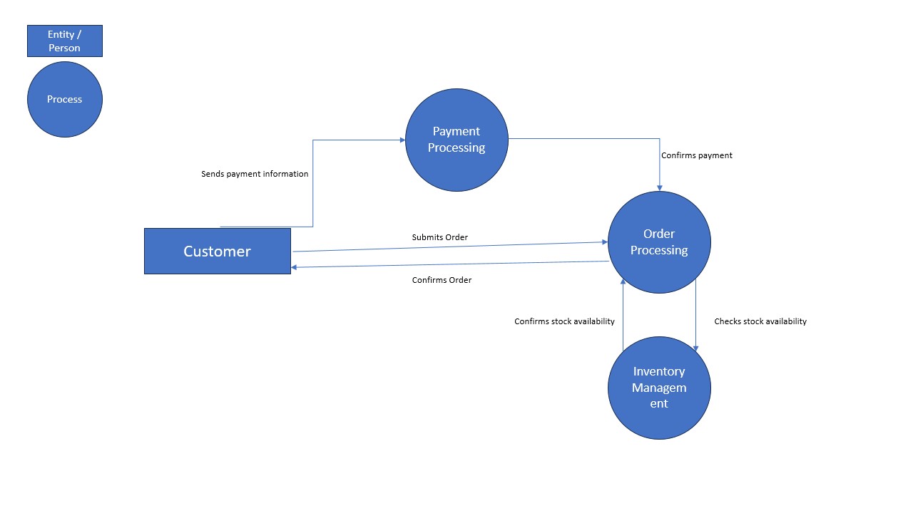
This should look similar in style to the sample diagram below, which shows business data flows, not personal data.
3. How to Collect / Obtain / Generate This Evidence
Follow these steps to build your Personal Data Flow Diagram.
You can sketch it in any tool you prefer — PowerPoint, Draw.io, Lucidchart, Miro, Canva, or even a PDF editor.
Step 1 — Identify where you collect personal data
List all touchpoints where your organisation collects data:
-
Website forms
-
Customer registration
-
Staff onboarding
-
Appointment/booking system
-
Payment checkout
-
Support/helpdesk
Step 2 — Identify systems that store or process this data
Common examples include:
-
CRM (HubSpot, Salesforce, Zoho)
-
HR systems (Talenox, BambooHR, JustLogin)
-
Email platforms (Google Workspace, Microsoft 365)
-
Payment processors (Stripe, PayNow, PayPal)
-
Project or ticketing systems (Jira, Zendesk)
-
Cloud storage (SharePoint, Google Drive)
Step 3 — Map the flows
Draw arrows to show how personal data moves:
-
From customer → website → CRM
-
From CRM → email system
-
From payment page → payment processor
-
From staff → HR system → payroll provider
For each arrow, label:
-
The type of personal data involved
-
The purpose (e.g., process order, respond to enquiry)
Step 4 — Include external processors
If data leaves your organisation, auditors must see it.
Examples:
-
Payroll vendor
-
Cloud hosting provider
-
Payment gateway
-
Marketing email provider
Step 5 — Export as an image or PDF
Most tools allow: File → Export → PNG/JPG/PDF.
Keep the final diagram clean and readable.
4. Evidence Format
Accepted File Types:
-
PNG
-
JPG
-
PDF
Suggested Naming Convention:
YourCompanyName_DataFlowDiagram_YYYY-MM-DD
Example:
AcmeClinic_DataFlowDiagram_2025-01-12.pdf
5. What “Good” Looks Like
A high-quality Personal Data Flow Diagram should have:
-
Clear entities
Labeled people or groups providing data (e.g., Customers, Staff). -
All major systems included
Internal systems + external vendors. -
Clear arrows showing direction of data flow
Each arrow must have a purpose and data type label. -
No ambiguous or missing steps
If personal data touches it, it must appear in the diagram. -
Readable layout
Avoid clutter — the sample provided is a good reference for simplicity. -
End-to-end visibility
Shows: collection → processing → storage → sharing/disposal.
Sample:
Why this matters: auditors want to see that you know where personal data travels, so that you can protect it deliberately — not by accident.
6. Tips
-
Keep it simple.
You’re drawing a map, not a masterpiece. The goal is clarity, not art. -
Redact sensitive data.
Never include real personal data in the diagram — only categories like “Name”, “Email”, “NRIC (if collected)”. -
Review it annually.
Systems change, processes evolve — keep the diagram fresh.